Posted on 2 Comments

Another WordPress Project Launched

Most people, when they think of WordPress, assume it’s for hobbyists and bloggers, and the the design will look like a template. The Crossing proves this assumption wrong. The website isn’t a blog in the usual sense, but a great example of how WordPress can be used for pure content management with a unique style of its own.

For this project, my friends at PlainJoe Studios created the site design and architecture, with complete Photoshop mockups. Based on their design, I built a custom WordPress child theme using the StudioPress Genesis framework. The final product includes some great features, including a widgetized homepage, a dynamic video gallery fed via Vimeo, and slick access to the site map via the Quick Links in the header (give it a try!).

Best of all, the client can easily manage their own website content. And that is something to give praise for.

WordPress — it’s not just for blogging.

Do you need a website that works for you (instead of against you)? I can help. I have a network of design and developer resources that team together to deliver dynamic, high-performance websites. Our team is known as Room Five, and we’re here to help. Contact me for details.


Posted on Leave a comment

Starbucks, The New Logo and The Real Customer

It’s been said that there are two kinds of people in the world; those that divide the world into two kinds of people, and those that don’t. I do.

And so…

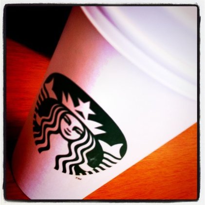
There are two kinds of people in the world. Those that like Starbucks, and those that don’t. I love Starbucks.Yes, it’s pricey, but I usually visit my local Starbucks on El Camino two or three times a week. My girlfriend would probably guess more frequently, but I’m not ready to admit to that.

[blackbirdpie url=”http://twitter.com/#!/jeffhester/status/45861891599368194″]

This week Starbucks is celebrating their 40th anniversary. Regardless of what you think of their coffee, you have to respect that they’ve done a few things quite well from a business perspective. In conjunction with their 40th anniversary, they rolled out their new logo. It’s not really all that new — but more of a modification. Essentially they stripped out the band with the text that read “Starbucks Coffee,” leaving only the siren.

There was an uproar when they announced the new logo back in January. Some of my designer and marketing friends were up in arms over the new design. “Big mistake” was the consensus. Now that it’s here, I don’t hear much from anyone. Certainly it didn’t seem to reduce the morning lineup at Starbucks. It didn’t confuse, confound or bother the average customer at all. Either they didn’t notice, or didn’t really care. If they did notice, it was a novelty — “Oh, look! They changed the logo!” A sort of positive vibe that keeping it fresh provides the brand.

Mark Hurst profiled Starbucks in last week’s Good Experience newsletter. He notes that the formula that drove success at Starbucks began to falter a couple years ago, but they’ve appeared to turn this around. CEO Howard Schultz explained to the Wall Street Journal how they turned things around. “Putting our feet in the shoes of the customer…” was his key message. Note that the average customer wasn’t bothered by the logo change. The noise generated by the design and branding community was simply that — noise.

Last week at Linked OC, Seth Godin shared an interesting anecdote about Starbucks. He noted that when they originally opened, they did not sell coffee. They sold coffee beans, but not coffee by the cup. The formula faltered until they brought in a new CEO who brought in the idea of serving espresso drinks such as he had seen in Italy, and the rest is history.

Where is all this headed? Well, we’ve established that I like Starbucks. Two out of my three offspring have worked for Starbucks (one still does). And Starbucks, in spite of all their success was not and is not immune to mis-steps, either. The key has been, and remains — keeping the customer in mind.

So then, who is your customer? And are they on your mind?

Posted on Leave a comment

Three Options for Custom Fonts on Your Website

A sample of the League Gothic web font

One of the challenges of designing for the web is that the font you want for your design may not be available on the computers your audience use. Resolving this usually requires either 1) Ditching the design intent and sticking with broadly supported font families; 2) Creating images containing text, in which case you can use whatever font you have; or 3) Using a web font type kit.

Option #1 is unappealing to most designers, although it shouldn’t be dismissed out of hand. There’s a good reason that those fonts are widely used. They’ve stood the test of time. Ever see the documentary Helvetica? Watch it.

Option #2 is not so great, though I’ve seen it done and it can work successfully if kept to a minimum. Images are always heavier than text alone, and much more difficult to update. Search engines can’t read them well, so you need to include ALT text.

Option #3 requires a little more effort, but the results are much more flexible. There are several web font kits available.

TypeKit was one of the original. They are a commercial service with access to a large library of quality, licensed fonts. You can get a free account for a single website, which is what I did recently for U.S. Speed Sport. You can see the page title (“Drag Racing” in this case) uses a special font provided by TypeKit. The drawback with the free account is that you have a limited library of fonts, and you’re required to display the TypeKit badge. It’s not obtrusive and might work for a smaller site, but bigger sites will probably want to pay for the non-badged license.

Google Web Fonts is a free alternative that is based on the TypeKit code. The javascript kits are very similar. The advantage here is that there is no badging requirement, but the library is even more limited than TypeKit’s free level.

My most recent discovery is a site called Font Squirrel. They literally hundreds of web fonts available in prebuilt kits, and you can create your own. I haven’t had a chance to use Font Squirrel yet, but it looks promising.

Are you using web fonts in your designs?

Posted on 1 Comment

Things Real People Don’t Say About Advertising

Things Real People Don’t Say About Advertising is a Tumblr-powered collection of cheesy stock photos poking fun at the world of advertising… and advertisers too-often disconnection with reality. It’s a breezy, easy site to scan, in much the same way as the Lolcats at I Can Has Cheezburger.

While it’s sure to make you smile, especially if you’ve been involved in advertising or even commercial web projects, TPDSAA has a very real point. Too often we miss the mark when trying to communicate. We spend too much time on minutiae, and make too many assumptions that “we” know what our audience wants because we think they are just like us.

We Are Not Our Audience

Whether “we” means an ad agency, design firm or an individual simply trying to stake their claim on the Internet, “we” are not the same as everyone else. In fact, everyone else is very different from us. We are too close to the subject to see it through the eyes of the average visitor.

Over and over I’ve heard anecdotes of people recruiting their mom as the ultimate usability tester. The assumption is, if mom gets it, everyone will. Honestly, this is not far from the truth. We need to interact. We need to be genuine. We need to ask — our visitors, employees, members or customers — what they really need and want. And then, we need to give it to them.

I’m not suggesting design by committee, or worse, design by community. There is still a need for vision and creativity. Our experience and knowledge can help create a user experience that delights. Doing so requires a combination of that know-how and a willingness to listen and adapt to genuinely serve the audience.

Check out TPDSAA. I guarantee you will find at least a few photos you’ll relate to. And if you’re in a position to influence user experience, think about how you can avoid ending up lampooned on TPDSAA.

Looking to improve user experience? Here’s two companies I recommend:

  • Adaptive Path provides a range of consulting services to help companies improve their user experience, as well as coordinating a series of events and conferences for user experience professionals.
  • Creative Good also provides consulting services for companies who want to improve the user experience, supplemented by councils — groups of peers sharing their knowledge and expertise. The annual GEL conference (Good Experience Live) draws a range of creatives in a format closer to TED than an typical conference.

Meantime, I’m thinking about how I can apply the humor of TPDSAA to the realm of knowledge management. Stay tuned…

Posted on 4 Comments

LunaTik & TikTok Unboxed

LunaTik and TikTok are a pair of wrist bands specifically designed to turn your iPod Nano into a multi-touch wrist watch. These beautiful watch straps were designed by Scott Wilson, former creative director at Nike Watches and founder of the Minimal design studio. They are beautifully designed and perfectly matched to the Nano. The best complement I can make is that if Apple designed a wrist band for the iPod Nano, it would probably look like this.

What really makes this band interesting was the way Scott and the Minimal team developed it. They had a great idea for converting the iPod Nano into a multi-touch watch, and to raise the capital they needed to take the bands from concept to production, they turned to Kickstarter. Kickstarter  allows people with an idea for a product, production or service to recruit micro-investments. The “investors” give a few bucks (or more), and rather than getting a share of ownership, they get the satisfaction of supporting someone with a great idea achieve their dream. And in some cases (as with TikTok and LunaTik) you get something in exchange.

Scott smartly put together great donor levels incentives. Pledge $25 or more and get a TikTok band. Pledge $50 or more and you got a LunaTik iPod Nano watch conversion kit. For $70 or more you got both. There were even bigger, fancier packages. In Scott’s case, their goal was to raise $15,000 — the minimum they felt they needed to justify the cost of going to production. They set a pledge deadline of December 16, but the response surprised them.

In the end, 13, 512 backers pledged a total of $941,718!

Needless to say, the project was a success, not only for Scott Wilson and Minimal, but for Kickstarter as well. Not that it wasn’t without some bumps in the road. Fulfillment was fraught with problems, as it turned out Kickstarter allowed people to pledge money without giving full addresses — obviously necessary for those getting the watch bands.

Scott did a great job of keeping the backers up to date with regular emails outlining the progress. He included photos as he travelled to China to meet with the manufacturer and shared videos of the bands being made.

A few notes about TikTok and LunaTik

  • The are designed to work with the 6th generation iPod Nano (the current model, as of Feb. 2011).
  • The iPod Nano is not included.
  • It is super easy to remove the iPod Nano from the TikTok. Snap it in; snap it out.
  • The LunaTik, on the other hand, is accurately labeled a watch conversion kit. While you can technically take your iPod Nano back out, it takes a couple special tools and some time.
  • They are big, but there are bigger watches out there. It’s definitely more of a man-sized watch though (sorry ladies).

The final product? See for yourself. Click any image below for a larger version.

Check out other projects on Kickstarter, learn what else Minimal has been designing, and if you’re interested in the LunaTik and TikTok watch bands, you can find out more at LunaTik.com.

One Last Thought

Someone is probably wondering why I would need both a LunaTik and a TikTok band, after all, I only have on iPod Nano. The reality is, I do not need both. I am thinking of a clever way to give one away. If you’ve got any ideas, leave me a comment!

Posted on Leave a comment

Help That Helps: Improving the User Experience

As a rule, a website should be self-explanatory; no help required. However there are cases where your customers (I prefer that to “users”) will need your help. Introducing new concepts; changing the interaction; and explaining a complex system are all opportunities to either serve your customer or leave them hanging.

In these cases, help should be readily available when you need it, and unobtrusive when you don’t.

Here are a couple of great examples of online help that really works.

When Facebook introduced their recent changes to the profile page, they offered a tour of the changes that highlighted each new feature without taking you away from your profile. This is awesome, because essentially the guide uses your own profile as an example rather than a generic “Joe Facebook.” The data and examples are all relevant to you because they are yours!

Xero.com is a cloud-based accounting system for business. Accounting is complex, and people tend to be a bit touchy about getting the numbers right, especially when it comes to their own money!

Xeno has done several things really well. They use a “welcome block” to put additional help right in front of new customers. They offer inline, contextual help that doesn’t take your focus from the current page. And they provide links to a more traditional, full-featured help or even live support when you need it.

Another nice touch? Note how the help is clearly identified throughout Xeno with the color orange. The customer will intuitively know when they are looking at help and when they are looking at part of their web app.

Have you seen or designed a great help system? Share it in the comments!

Posted on 2 Comments

Flipboard: The Number 1 Must-Have iPad App

My iPad has officially replaced my trusty Moleskine notebook. Instead of paper and pen, my iPad comes to my meetings, to Starbucks, and pretty much everywhere I go. There are a lot of wonderful apps for the iPad, and I’ll get into them in good time. But one app really stands out in it’s design, beauty and function — Flipboard.

I first read about Flipboard months before I finally plunked down the cash for an iPad, and it had already captured my attention. It’s remarkable in that Flipboard really doesn’t do anything that I couldn’t do before.

What is Flipboard?

Essentially, Flipboard is a different way of reading and consuming media that I’ve already been reading and consuming via other means. What makes Flipboard remarkable is that it does it so elegantly.

Flipboard transforms Twitter, Facebook, Flickr, Google Reader and RSS feeds into a beautiful, magazine-like interface that leverages all the good bits of the iPad. A Twitter stream is noisy and difficult to browse. The same stream through Flipboard is a pleasure. Links, photos and videos show up inline without requiring extra clicks, making browsing your streams not only a pleasure, but making it possible in a new way.

Here are a few screenshots to help tell the Flipboard story. Click any thumbnail to browser the larger images.

I still use Twitter and Facebook, but reading the same streams via Flipboard never fails to surface new and interesting conversations that I might have otherwise overlooked.

If you have an iPad, you must download and use Flipboard. Hell, it’s free.

If you don’t have an iPad, Flipboard might be reason enough to get one.