
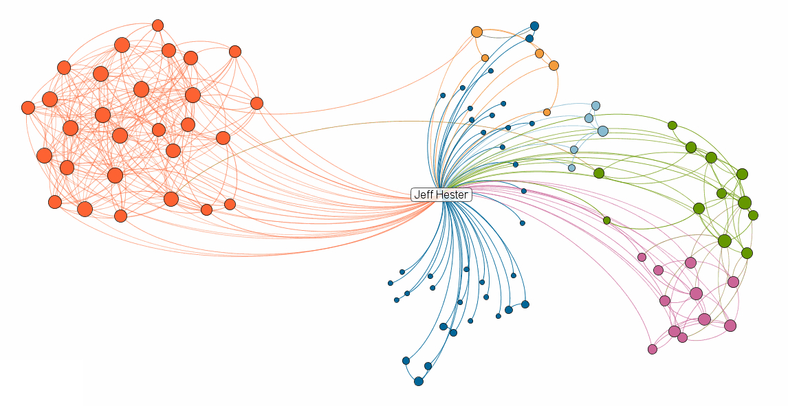

LinkedIn Labs has introduced InMaps – a visualization of your LinkedIn network. I first heard about InMaps via a Tweet from fellow #SMMOCer Mel Aclaro. LinkedIn wisely made sharing easy, and so a quick search will find plenty of fresh tweets about this as people discover the new feature.
I gave InMaps a quick spin and quickly discovered LinkedIn’s not-so-subtle ulterior motive: You can’t create a visualization unless you have at least 50 connections and your profile is at least 75% complete.
I’ll bet you a cold beverage that LinkedIn enjoys an sudden surge in both profile completion and network connections as a result.
For LinkedIn, it’s a brilliant move. By offering something sexy that people want (the groovy diagrams) but requiring them to step up and engage on a deeper level, the entire network wins. And (theoretically) they drive the behavior that they want from their community — people sharing deeper knowledge about their experience and connections.
How can we bring change to our community/organization/business/world? One small incentive at a time.
If you care, you can check out my visualization, create your own, or connect with me on LinkedIn.